How commercial spaces interiors shape customer dwell time
Time
Click Count
Commercial spaces interiors influence dwell time when they reduce friction, give people a reason to pause, and make the next action obvious. A visually impressive store, lobby, showroom, or service venue can still produce short visits if customers cannot orient themselves, feel exposed while browsing, or find a comfortable place to compare options. The goal is not to keep people inside for its own sake. It is to create enough comfort, clarity, and relevant discovery for a short visit to become a productive one.
For commercial leaders, this changes the design brief. Instead of asking whether an interior “looks premium,” ask where customers slow down, what they notice in sequence, where they hesitate, and whether that hesitation leads to exploration or abandonment. Layout, lighting, fixtures, seating, signage, materials, and retail technology should be selected as one operating system rather than as separate decoration and procurement decisions.
Design for purposeful movement, not maximum circulation
The first interior decision affecting dwell time is the path customers take after entering. Open circulation can feel welcoming, but an entirely exposed floor often encourages people to scan quickly and leave. A tightly controlled route can increase exposure to products, yet it becomes frustrating when customers are in a hurry or need a specific service. The useful middle ground is a layout that offers a clear primary path with visible opportunities to branch off.
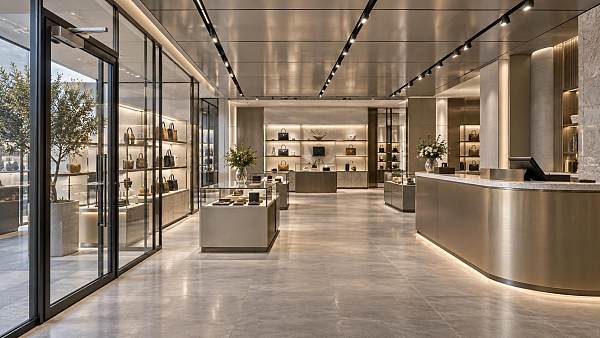
Entry zones need particular restraint. Customers use the first few moments to understand the venue: where they are, what is available, and whether the space feels easy to enter. Large promotional displays, queues, security equipment, and dense fixture clusters all competing at the threshold create cognitive load. Keep the entrance legible, then place the first discovery point slightly beyond it. This could be a focused product story, a consultation zone, a seasonal display, or a visible demonstration area.
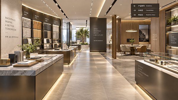
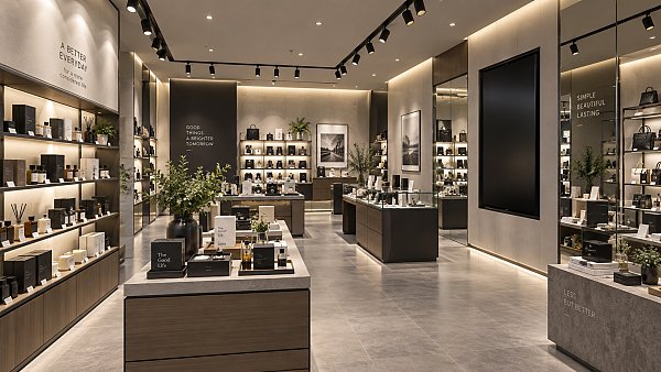
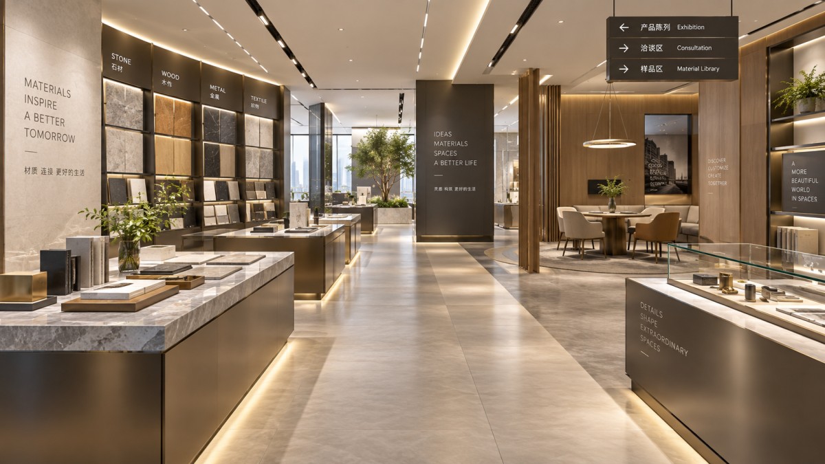
Commercial spaces interiors work best when they create a rhythm between movement and pause. High-traffic areas should be easy to navigate. Deeper areas should reward exploration with better product comparison, a calmer atmosphere, or access to assistance. In a retail environment, that may mean using perimeter walls for category orientation, central fixtures for discovery, and dedicated stations for products that require consideration. In a showroom, it may mean moving from broad applications to material samples, technical details, and consultation.
Comfort changes browsing behavior more than spectacle does
Customers rarely describe dwell time as a comfort issue, but comfort determines whether they feel able to stay. Temperature, acoustics, glare, standing fatigue, personal space, and queue visibility all shape this decision. A striking interior with harsh lighting, noisy hard surfaces, or nowhere to rest can make people leave before they engage with the offer.
Seating is often misunderstood. It should not be added indiscriminately to increase time on site. It is most useful where customers are waiting, accompanying a shopper, reviewing options, receiving a service, or using a digital tool. In those situations, a bench or small seating area protects the wider experience: it prevents waiting customers from blocking aisles, reduces impatience, and gives companions a reason not to rush the visit.
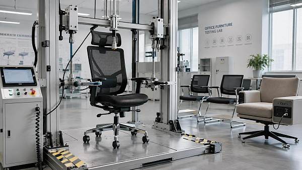
Furniture selection should reflect duration and maintenance, not only style. Lightweight occasional seating may suit a quick-service environment, while a consultation-led business needs chairs that support longer conversations. Upholstery, finishes, and construction must also match cleaning routines, traffic levels, and replacement plans. A damaged chair, wobbly table, or visibly worn display fixture quietly signals that the space is not being managed, which weakens trust even when the core product is strong.
Acoustics deserve the same operational attention. Hard floors, glass, exposed ceilings, and dense product displays can amplify voices, equipment noise, and music. Some activity is useful because it signals energy; persistent noise makes comparison, consultation, and service interaction difficult. Absorbent ceiling treatments, acoustic wall elements, zoning, and appropriate speaker placement can create distinct environments without turning the space into a silent room.
Use lighting to support decisions at different stages
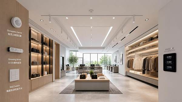
Lighting affects dwell time because it influences both orientation and confidence. Uniform brightness makes a space easy to operate but can flatten the experience. Highly dramatic lighting can create atmosphere but may hide product details, distort color, or make customers feel self-conscious. The better approach is layered lighting with a job assigned to each layer.
Product evaluation zones need special care. If a customer must judge color, texture, finish, fit, or packaging, the light should make that assessment easier rather than merely more theatrical. Reflective surfaces also require planning: glare on a refrigerated case, digital screen, glass counter, or polished tabletop can shorten an interaction immediately.
Lighting should also align with how the space changes during the day. A café may need a different mood during the morning rush than in the afternoon. A department store may need stronger wayfinding when footfall is high and more focused presentation in lower-traffic periods. Dimmable and zoned systems provide flexibility, but only when staff have simple operating rules. An advanced control system that no one adjusts is not an experience strategy.
Make discovery easy without turning the space into a signboard
Customers stay longer when they can answer basic questions without asking for help: What is here? Where do I go next? What is this product for? How do options differ? What should I do if I want to buy, book, or speak to someone? Signage should reduce uncertainty at these moments.
A common mistake is treating every sign as a promotional surface. Promotional messages compete with directional, informational, and service messages, especially in spaces with frequent campaigns. Establish a hierarchy. Permanent signs should support navigation and category understanding. Temporary signs should call attention to limited offers or changing priorities. Digital screens should earn their presence by providing information that changes, demonstration content, queue status, or useful comparison support.
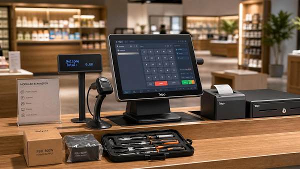
Digital retail tools can extend dwell time when they remove a real barrier. A product comparison screen, self-service lookup point, appointment check-in, or assisted POS station can keep customers engaged at the moment of consideration. Screens used only to play generic brand content often become background noise. Before installing any smart retail technology, define the customer task it will improve and the staff workflow needed to support it.
Plan dwell zones around the business model
Not every business needs the same kind of lingering. A convenience-led format benefits from a fast, dependable journey and brief pauses at high-value discovery points. A high-consideration purchase benefits from material libraries, comparison tables, private consultation areas, and places for accompanying decision-makers. Hospitality and mixed-use environments need transitions between active social zones and quieter recovery areas.
The wrong model can be expensive. A fashion retailer may lose selling area by creating lounge-like spaces with no link to fitting rooms, styling, or product discovery. A financial or healthcare-adjacent service environment may create anxiety by placing confidential conversations in a highly visible open area. A premium showroom may undermine its offer by using low-cost fixtures that make samples and displays feel temporary.
Use dwell zones only where a longer interaction contributes to a business outcome: comparison, consultation, cross-category discovery, community use, service recovery, or queue comfort. Every zone should have a clear relationship to circulation, staff sightlines, cleaning, power access, and replenishment. These practical details determine whether an attractive concept continues to work after opening.
Measure behavior before expanding the concept
Dwell time is meaningful only when read alongside other signals. A longer visit can indicate greater product engagement, but it can also indicate confusing navigation, slow service, or a queue problem. Review it with conversion, consultation completion, fitting-room usage, queue abandonment, repeat visits, staff intervention, and performance by zone.
Begin with a small set of questions. Which zones attract people but fail to convert? Where do customers stop unexpectedly? Which displays receive attention but cause congestion? Are employees repeatedly giving the same directions? Do people leave before reaching the area where comparison or consultation happens? Observational reviews, transaction patterns, queue data, and privacy-conscious footfall analysis can reveal different parts of the same journey.
Test changes in a controlled sequence. Move one display family, revise one sign hierarchy, adjust one lighting zone, or add a single consultation surface before changing the whole environment. This makes it easier to identify the source of improvement and avoids treating interior design as a one-time capital project.
Procurement decisions that protect the experience over time
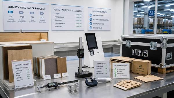
The most persuasive commercial interior loses value when fixtures fail, finishes age poorly, replacement parts are unavailable, or installations cannot adapt to new assortments. Specify commercial-grade furniture, display systems, lighting, and technology according to expected use, maintenance capability, and local compliance requirements. The lowest purchase price can become the highest operating cost when a component is difficult to clean, repair, reconfigure, or source consistently across locations.
This is where cross-category benchmarking becomes useful. G-BCE helps commercial architects and sourcing teams examine furniture and fixtures, smart retail technology, lighting and signage, supply-chain considerations, and sustainable packaging through a common performance lens. The objective is not to make every site identical. It is to build a repeatable system in which materials, hardware, serviceability, visual standards, and customer experience remain aligned across markets.
Sustainable materials should be assessed in the same practical way. A material choice supports the customer experience when it is durable, appropriate to the touch, visually consistent over time, and compatible with maintenance. Sustainability claims alone do not solve the operational question. Teams need to understand replacement cycles, cleaning requirements, repair options, packaging impact, and whether the material can be reliably specified at scale.
Start with the moments that currently cause people to leave
The strongest improvement usually does not begin with a full redesign. Map the customer journey from entry to exit and identify the points where people become uncertain, uncomfortable, delayed, or disconnected from the offer. Then decide whether the cause is spatial, operational, informational, or technological. A new fixture will not fix a poorly managed queue, and a digital screen will not compensate for a confusing floor plan.
When commercial spaces interiors support movement, comfort, product evaluation, and staff service at the same time, dwell time becomes a by-product of a better visit. That is the durable target: customers stay because the environment helps them make progress, not because the exit is difficult to find.
News Recommendations
 How commercial spaces interiors shape customer dwell time
![51a6ab95581761cc26f4318be6520c15]()
Aris Katos
Future of Carbide Coatings
 How LED commercial lighting design reduces glare in retail spaces
![51a6ab95581761cc26f4318be6520c15]()
Aris Katos
Future of Carbide Coatings
 How industrial technology information improves RFID inventory accuracy
![51a6ab95581761cc26f4318be6520c15]()
Aris Katos
Future of Carbide Coatings
 When drip garden watering systems make more sense than sprinklers
![51a6ab95581761cc26f4318be6520c15]()
Aris Katos
Future of Carbide Coatings
 When category comparison improves sourcing for industrial applications
![51a6ab95581761cc26f4318be6520c15]()
Aris Katos
Future of Carbide Coatings
 Industrial application guidance for selecting the right LED lighting
![51a6ab95581761cc26f4318be6520c15]()
Aris Katos
Future of Carbide Coatings
 Which commercial architecture standards apply to European retail fit-outs?
![51a6ab95581761cc26f4318be6520c15]()
Aris Katos
Future of Carbide Coatings
 How to verify FDA requirements for maternity care products
![51a6ab95581761cc26f4318be6520c15]()
Aris Katos
Future of Carbide Coatings
 How to verify BPA-free claims for food-contact products
![51a6ab95581761cc26f4318be6520c15]()
Aris Katos
Future of Carbide Coatings
 When does a European wholesale supplier suit modular office projects?
![51a6ab95581761cc26f4318be6520c15]()
Aris Katos
Future of Carbide Coatings
 When consumer ecosystem solutions improve the in-store shopping journey
![51a6ab95581761cc26f4318be6520c15]()
Aris Katos
Future of Carbide Coatings
 How a commercial developers network can reduce site selection risk
![51a6ab95581761cc26f4318be6520c15]()
Aris Katos
Future of Carbide Coatings
 How clear purchasing specifications prevent costly supplier deviations
![51a6ab95581761cc26f4318be6520c15]()
Aris Katos
Future of Carbide Coatings
 What an ISTA drop test lab checks before your packaging ships
![51a6ab95581761cc26f4318be6520c15]()
Aris Katos
Future of Carbide Coatings
 Which commercial furniture standards apply to workplace seating?
![51a6ab95581761cc26f4318be6520c15]()
Aris Katos
Future of Carbide Coatings
 How to evaluate smart lighting module OEM compatibility before sampling
![51a6ab95581761cc26f4318be6520c15]()
Aris Katos
Future of Carbide Coatings
 How to assess whether sustainable technology delivers real impact
![51a6ab95581761cc26f4318be6520c15]()
Aris Katos
Future of Carbide Coatings
 How to assess an OEM supplier’s quality control before ordering
![51a6ab95581761cc26f4318be6520c15]()
Aris Katos
Future of Carbide Coatings
 How consumer ecosystem solutions data can improve retail personalization
![51a6ab95581761cc26f4318be6520c15]()
Aris Katos
Future of Carbide Coatings
 When does consumer packaging design justify a higher product price?
![51a6ab95581761cc26f4318be6520c15]()
Aris Katos
Future of Carbide Coatings
 Supermarket Fixture Installation: Planning Layouts, Wiring, and Handover
![51a6ab95581761cc26f4318be6520c15]()
Aris Katos
Future of Carbide Coatings
 Automated Lighting and Smart Lighting Control in Bergerac: Key Project Considerations
![51a6ab95581761cc26f4318be6520c15]()
Aris Katos
Future of Carbide Coatings
 Segment Streetlight Controllers: Choosing Control Modes for Urban Roads
![51a6ab95581761cc26f4318be6520c15]()
Aris Katos
Future of Carbide Coatings
 IEC 62471-2 Explained: How to Assess Photobiological Risks in LED Lighting
![51a6ab95581761cc26f4318be6520c15]()
Aris Katos
Future of Carbide Coatings
 Food Grade Packaging Requirements by Product Type, Temperature, and Contact Risk
![51a6ab95581761cc26f4318be6520c15]()
Aris Katos
Future of Carbide Coatings
 Food Packaging Compliance Checklist: Tests, Records, and Labeling Before Shipment
![51a6ab95581761cc26f4318be6520c15]()
Aris Katos
Future of Carbide Coatings
 NSF Food Packaging Standards: When Certification Matters for Commercial Food Use
![51a6ab95581761cc26f4318be6520c15]()
Aris Katos
Future of Carbide Coatings
 FDA Food Grade Compliance: Which Materials and Documents Do Buyers Need?
![51a6ab95581761cc26f4318be6520c15]()
Aris Katos
Future of Carbide Coatings
 What Should a Food Grade Declaration Include for Packaging Compliance?
![51a6ab95581761cc26f4318be6520c15]()
Aris Katos
Future of Carbide Coatings
 Housewares Importing: How to Evaluate Suppliers, Costs, and Compliance Risks
![51a6ab95581761cc26f4318be6520c15]()
Aris Katos
Future of Carbide Coatings
 Why Freeze-Dried Fruit Ingredients Lose Crispness—and How to Prevent It
![51a6ab95581761cc26f4318be6520c15]()
Aris Katos
Future of Carbide Coatings
 What industry veterans look for before choosing a new supplier
![51a6ab95581761cc26f4318be6520c15]()
Aris Katos
Future of Carbide Coatings
 How material fatigue can shorten the service life of retail shelving
![51a6ab95581761cc26f4318be6520c15]()
Aris Katos
Future of Carbide Coatings
 What makes a global sourcing platform reliable for supplier verification?
![51a6ab95581761cc26f4318be6520c15]()
Aris Katos
Future of Carbide Coatings
 When are double platinum spark plugs a better choice than iridium?
![51a6ab95581761cc26f4318be6520c15]()
Aris Katos
Future of Carbide Coatings
 How to assess a POS terminal manufacturer in Europe for long-term support
![51a6ab95581761cc26f4318be6520c15]()
Aris Katos
Future of Carbide Coatings
 How data transparency in retail helps prevent inventory discrepancies
![51a6ab95581761cc26f4318be6520c15]()
Aris Katos
Future of Carbide Coatings
 What makes a product comparison guide actually useful for buying decisions
![51a6ab95581761cc26f4318be6520c15]()
Aris Katos
Future of Carbide Coatings
 How to evaluate a barcode scanner manufacturer for kiosk projects
![51a6ab95581761cc26f4318be6520c15]()
Aris Katos
Future of Carbide Coatings